- Website builder
- Building pages
- Tablet & phone
Tablet and phone design
Check every page on tablet and phone, change spacing or sizes for one screen only, and hide things on small screens.
Most of your visitors will arrive on a phone. NijeesWeb pages adapt to small screens on their own — columns stack, text wraps — and you can fine-tune each screen size without designing the page twice.
The idea: design once, adjust where needed#
You design the desktop version. The tablet and phone versions start as copies of it — every setting reads Same as desktop — and you only change the few things that need changing on a smaller screen, such as smaller padding or a smaller heading. Everything you leave alone keeps following desktop, so later desktop changes flow through automatically.
1. Preview the page on smaller screens#
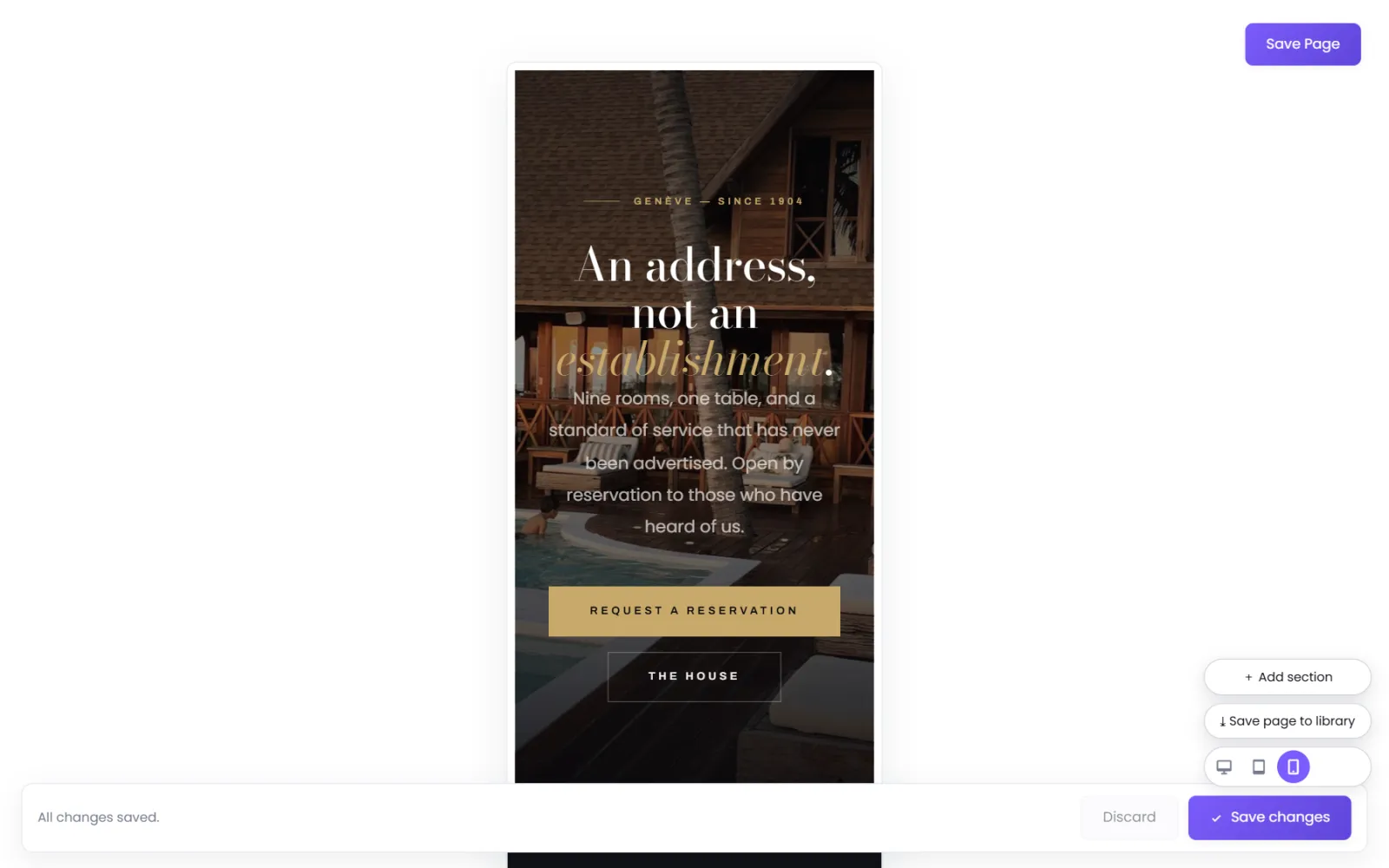
At the bottom of the builder, use the three icons:
| Icon | Preview width |
|---|---|
| 🖥 Desktop | full width |
| ▭ Tablet | 820 px |
| 📱 Phone | 390 px |
The canvas narrows to that width so you see the page as a tablet or phone would. Previewing never changes the page.
2. Change a setting for one screen size#
- Open the settings (⚙) of a row, column or element.
- On the Design tab, in the screen bar at the top, choose Tablet or Phone. The bar reminds you: Options left on "Same as desktop" inherit the desktop styling.
- Find the setting to change — padding, for example — and switch its Style from Same As Big Screen to Custom.
- Enter the value for this screen size and select Save changes.
Back on desktop nothing has changed; only the screen size you chose uses the new value.
To start over on a screen size, select Reset All in the screen bar.
3. Hide something on phones (or desktop)#
Every row, column and element has Visibility on the Advanced tab of its settings, with three switches:
- Desktop — 1025 px and up
- Tablet — 768 px to 1024 px
- Phone — up to 767 px
Clear a switch to hide the item on that screen size. It is removed from the page there, not just made invisible — so it costs no loading time.
In the builder, a hidden item is shown dimmed with a dashed outline in that preview, so you can still reach it to switch it back on.
4. Column widths on phones#
On phones, columns stack one under another at full width. To keep two small columns side by side on phones instead (two icons, say), switch to the Phone preview and drag the handle between the columns: it sets their width on phones only.
Header and footer on phones#
Your header turns into a menu button on smaller screens, with its own phone menu. Its sizes and spacing for tablet and phone are set in the Header Manager — see Header.
Checklist for every page#
- Open the Phone preview and scroll the whole page.
- Is any text too big, or squeezed into a narrow column?
- Is padding so large that a section is mostly empty space? Reduce it for phones.
- Are buttons easy to tap, and not too close together?
- Then check on a real phone too — nothing replaces it.
Was this page helpful?
Something is missing — tell us