Header Manager
Your logo, the menu bar's look, sticky and transparent headers, the search icon, a call-to-action button, and tablet and phone sizes.
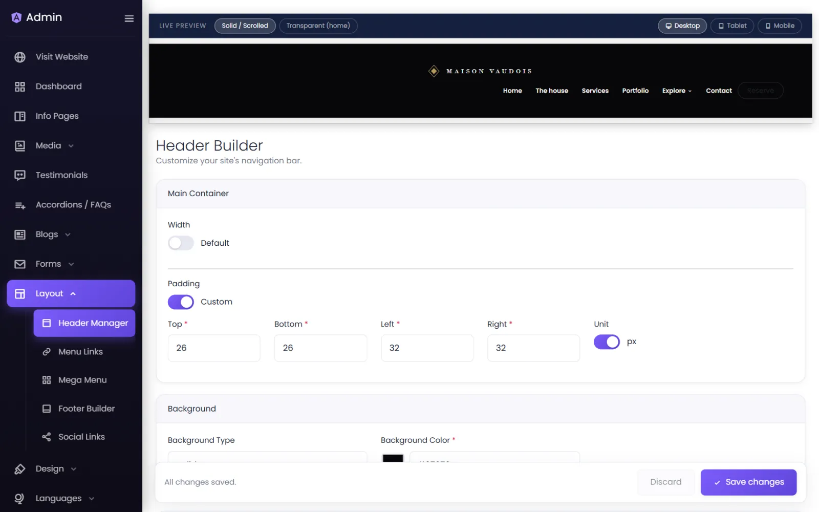
Layout › Header Manager controls the bar at the top of every page: your logo, the menu's look and the header's behaviour. A Live Preview at the top shows the result as you change things — switch it between Solid / Scrolled and Transparent (home) to see both states.
Your logo#
Under Logo:
- Image — select Select from Media to pick your logo from the media library, or upload it there first.
- Logo Alignment — left, centre or right.
- Display Logo — Side by side with links (most common) or Above the links (a centred logo over the menu).
- Logo Max Width — how wide the logo may get.
The bar#
- Main Container — the bar's Width and Padding (top, bottom, left, right).
- Background — Solid with a colour, or Gradient with two colours and a direction.
The links#
- Links Alignment and Centre On — centre the links in the space left by the logo, or on the bar itself.
- Font Color, Hover Color, Font Weight, Font Size (any CSS size, such as
16px,1.2remorclamp(14px, 1.2vw, 18px)), Font Family, Links Padding. - Manage Menu Links — the links themselves are edited in Menu Links.
- Dropdown Links — the width, padding, background and corner radius of dropdown menus.
- Bar Style and Menu & Link Effects — hover underlines, highlights and other effects for the links.
Behaviour & Actions#
- Navbar Type
- Normal — scrolls away with the page.
- Sticky — stays pinned to the top.
- Sticky & shrink — pinned, and padding, logo and bar height ease down once the visitor scrolls.
- Transparent over the home hero — the header starts see-through on the home page and fades in its background on scroll. Best with a full-width picture as the home page's first section. Set the Link Colour (while transparent) so links stay readable over the picture, and optionally a Divider Below the Header.
- Site Search — Show search icon adds a search that looks through your pages and blog posts.
- Call-to-action Button — Show button, with Button Text (such as Get in touch), Button Link (such as
/contact) and Open in a new tab. It uses your theme's button style. The button only appears once a link is set.
Tablet and phone#
Under Responsive, three sizes: Mobile (up to 575 px), Tablet (576–991 px) and Desktop (992 px and up). Below 992 px the links collapse into a menu button automatically.
For Tablet or Mobile, switch on Override → Use different padding / logo size here, then set the Bar Padding, logo size and Links Font Size for that size. 0 keeps the desktop size; blank keeps the desktop font size.
Use your own HTML header#
If you prefer to write the header yourself, see Custom header & footer code.
Let the header float over a picture on one page#
A page that opens on a full-width picture can let the header sit on top of it: in Info Pages, select Edit on the page and choose Let the header float over the content.
Was this page helpful?
Something is missing — tell us