Footer Builder
Build your footer from rows and columns of headings, text, images, links and social icons — with its own design and phone settings.
Layout › Footer Builder designs the band at the bottom of every page. A Live Preview at the top updates as you work. The footer has four tabs: Major Settings, Design, Responsive and Builder.
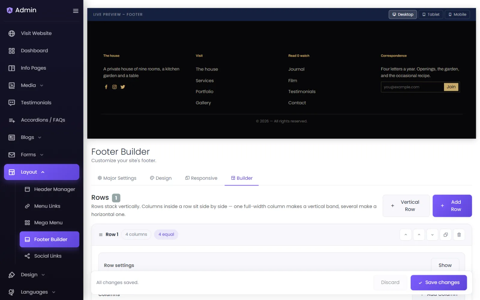
Builder: rows, columns, elements#
Rows stack vertically. Columns inside a row sit side by side.
- Add Row starts a three-column band; Vertical Row starts a single full-width one.
- Each row has Row settings: Column Layout (1 full width, 2 halves, 3 thirds, 4 quarters, 2 : 1, 1 : 2, or custom per column), Gap, Vertical Align, Stack Columns (on tablet and below — recommended, on mobile only, or never), Hide This Row On a screen size, a Divider Below Row, padding and its own background.
- Each column has Content Alignment and Hide This Column On; select Add Column to add more.
Add elements to a column:
| Element | Use it for |
|---|---|
| Heading | A column title, such as Quick links. |
| Text | Your address, opening hours, a short about line. |
| Image | Your logo, or certification badges — with alt text and an optional link. |
| Links | Manual Links (select + Add Page Link… for your pages, or Custom Link for any address), or an automatic list of your Image Galleries or Video Galleries. |
| Social Links | Icons for the profiles in Social Links. |
| Email Input | An email box with a button, styled to match the footer. |
Design#
Footer-wide styling: Background (solid, gradient or image, with a Tint Overlay), Spacing & Layout (padding, margin, corner radius, content width), and global styles for Headings, Text, Links, Social Icons and the Email Input. The Bottom Bar holds the Copyright Text and an optional divider.
Responsive#
The same three sizes as the header — Mobile (up to 575 px), Tablet (576–991 px), Desktop (992 px and up). Switch on Override → Use different padding / alignment here for tablet or mobile to change the padding or text alignment there.
Major Settings#
Status — Active shows the footer; Inactive hides it on every page.
Was this page helpful?
Something is missing — tell us