Header
Design the bar at the top of every page — sticky or static, transparent on the home page, colours, spacing — with a live desktop, tablet and phone preview.
The header is the bar at the top of every page: your logo, the menu, and the search, account, wishlist and cart icons. Design it under Layout → Header Builder.
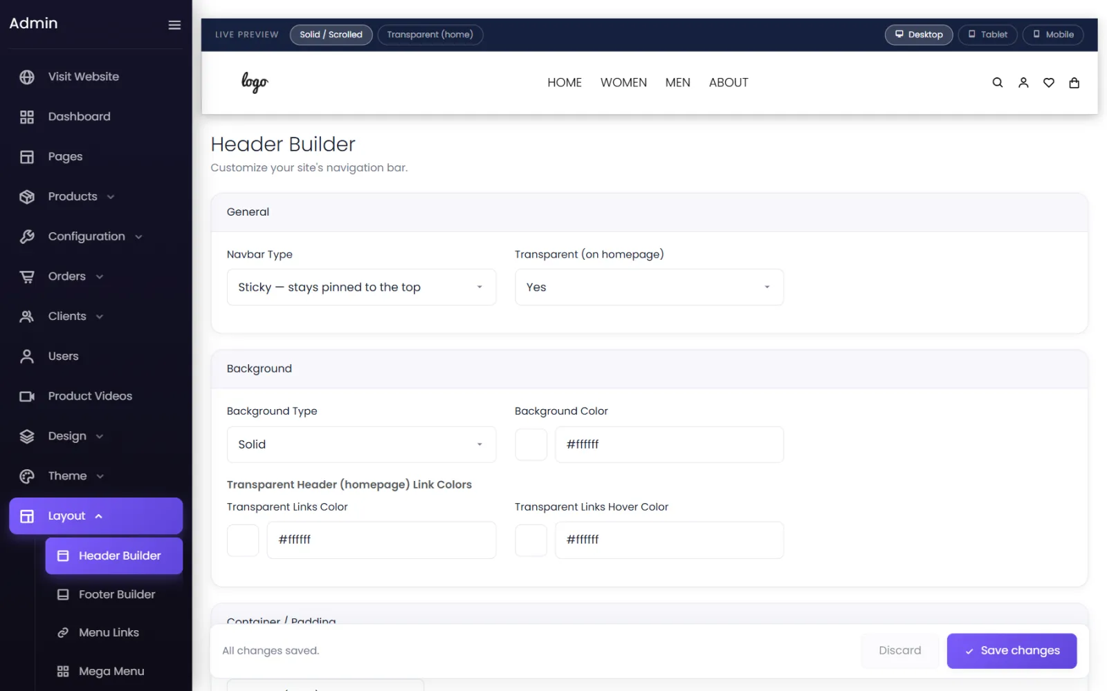
The Live preview at the top shows the header as you change it — switch between Solid / Scrolled and Transparent (home), and between Desktop, Tablet and Mobile.
General#
- Navbar Type — Sticky (stays pinned to the top), Sticky & shrink (pinned, and compacts as the visitor scrolls) or Normal (not sticky), which scrolls away with the page.
- Transparent (on homepage) — the header sits over the home page's first banner and turns solid when the visitor scrolls. Make sure the home page's first row is a full-width image, and set that page's header to float over the content (in Pages → Edit).
Background#
- Background Type and Background Color — the solid header's look.
- Transparent Header (homepage) Link Colors — the link and link-hover colours while the header is transparent, usually white over a photo.
Spacing and more#
Container / Padding and the remaining groups set the header's width, height, spacing and the colours of links and icons.
Logo and menu#
- The logo comes from Settings → Branding.
- The menu comes from Layout → Menu Links, or the Mega Menu. See Menus and mega menu.
Ready-made headers#
Design → Import Designs → Headers has header designs included with your plan, and Theme → Website Themes can apply a theme's header. See Design library.
Select Save changes when you are done.
Was this page helpful?
Something is missing — tell us