- Online store builder
- Storefront design
- The page builder
The page builder
Build store pages from rows, columns and elements — add, move and style them, preview phone and tablet, hide parts on some screens, and save sections to reuse.
The page builder is where you design a page. Every page is made of rows; a row holds columns side by side; a column holds elements — a heading, an image, a products grid.
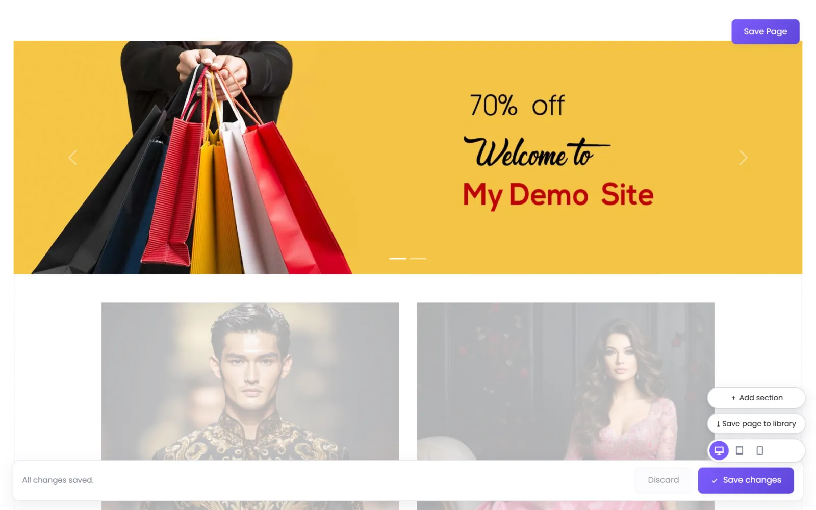
Open it with Builder on a page's row in Pages (or straight after creating a page).
Rows#
- Add Row — adds an empty row.
- Move row up / Move row down — reorder rows.
- Row settings — the row's padding, margin, background and other design; Visibility; CSS classes and IDs; and Custom CSS and Custom JS for this row only.
- Save this section to my library — keep the row to reuse on other pages.
Columns#
- Add a column with + on the row.
- Move column left / right, and drag the divider between two columns to resize them.
- Column settings — padding, margin, background, and Visibility.
Elements#
- Select the + inside a column. Add an element opens.
- Pick an element: Heading, Text, Blurb, Button, Single Image, Single Video, Banners, Products, Categories, Brands, Vid And Prod, Image Gallery, Video Gallery, Testimonials, Form, Blogs or Accordion.
- Its settings open with three tabs:
- Content — what it shows (the words, the image, which products);
- Design — how it looks (fonts, colours, sizes, alignment);
- Advanced — spacing, visibility, CSS.
- Save changes. Use Move element up / down to reorder.
Every element is described in Store elements.
Phone, tablet and desktop#
The buttons at the bottom right switch the preview between desktop, tablet and phone. Padding and widths can differ per screen: choose Same As Big Screen, or Custom to set them for that screen size.
Visibility on a row, column or element hides it on the screen sizes you untick — Desktop (992 px and up), Tablet (768–991 px), Phone (up to 767 px). It is removed from the page on those sizes, not just hidden. Use it for a phone-only banner, for example.
Ready-made sections and your library#
- + Add section — add a ready-made section, or one from your library, to this page.
- ⤓ Save page to library — save the whole page, so new pages can start from it.
- Save this section to my library (on a row) — save one row.
Everything you save is under Theme → My Library. See Design library.
Saving#
Select Save Page (top right) or Save changes in the bar at the bottom, or press Ctrl + S. Changes are live on your store as soon as they are saved.
Was this page helpful?
Something is missing — tell us