Your theme — colours, fonts and shape
Set your store's colours, typography and shape once, and every page, button and card follows — with a live preview.
Theme → Theme holds your store's design tokens — the colours, type and shape every page uses. Change a colour here and every button, link and card that uses it changes with it.
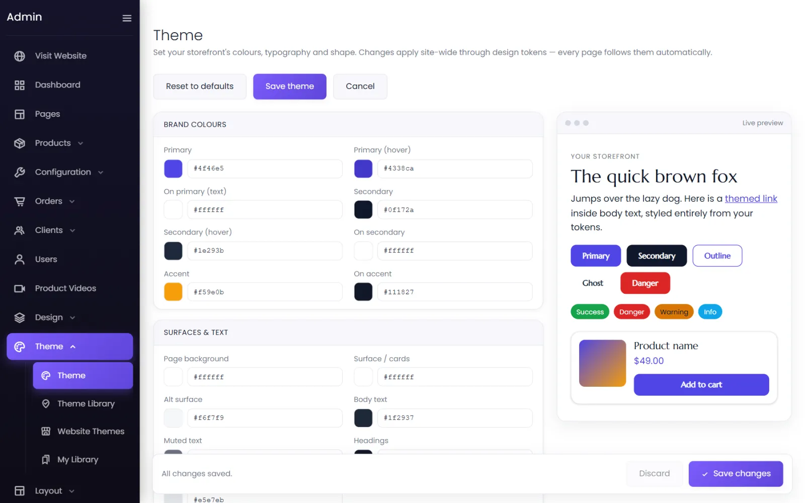
Brand colours#
| Token | Used for |
|---|---|
| Primary / Primary (hover) | Main buttons — Add to cart, Checkout — and their hover colour. |
| On primary (text) | Text on primary buttons. Make sure it contrasts. |
| Secondary / Secondary (hover) / On secondary | Second-level buttons. |
| Accent / On accent | Highlights, badges and offers. |
Surfaces and text#
Page background, Surface / cards, Alt surface, Body text, Muted text, Headings and Borders.
Status colours#
Success, Danger, Warning and Info — messages such as Added to cart or Out of stock.
Typography#
Body font, Heading font, Base size and Line height. Type a font name; the list suggests ones that work.
Shape and depth#
Radius (small / medium / large) — how rounded corners are — and Shadow (small / medium).
Buttons#
The default button: Background, Text, Hover background, Hover text, Border colour, Border width, Border style, Corner radius, Font size, Font weight and Letter spacing.
Preview and save#
The Live preview on the right shows sample text, a themed link, every button style (Primary, Secondary, Outline, Ghost, Danger), status colours and a product card as you change things. Select Save theme to apply it to your store, or Cancel. Reset to defaults restores the starting values.
The quick way: a ready-made theme#
Theme → Theme Library applies a complete theme — colours, buttons and custom CSS — in one click. See Theme library. Your site's font can also be set in Settings → Branding.
Was this page helpful?
Something is missing — tell us