- Online store builder
- Storefront design
- Product cards
Product, category and brand cards
Design how products, categories and brands look in grids and carousels — padding, background, border, shadow, title, price, image, hover — and choose the active design.
A card is how one product (or category, or brand) appears in a list — on your home page, category pages and search. You design cards under Design → Product, Design → Category and Design → Brand.
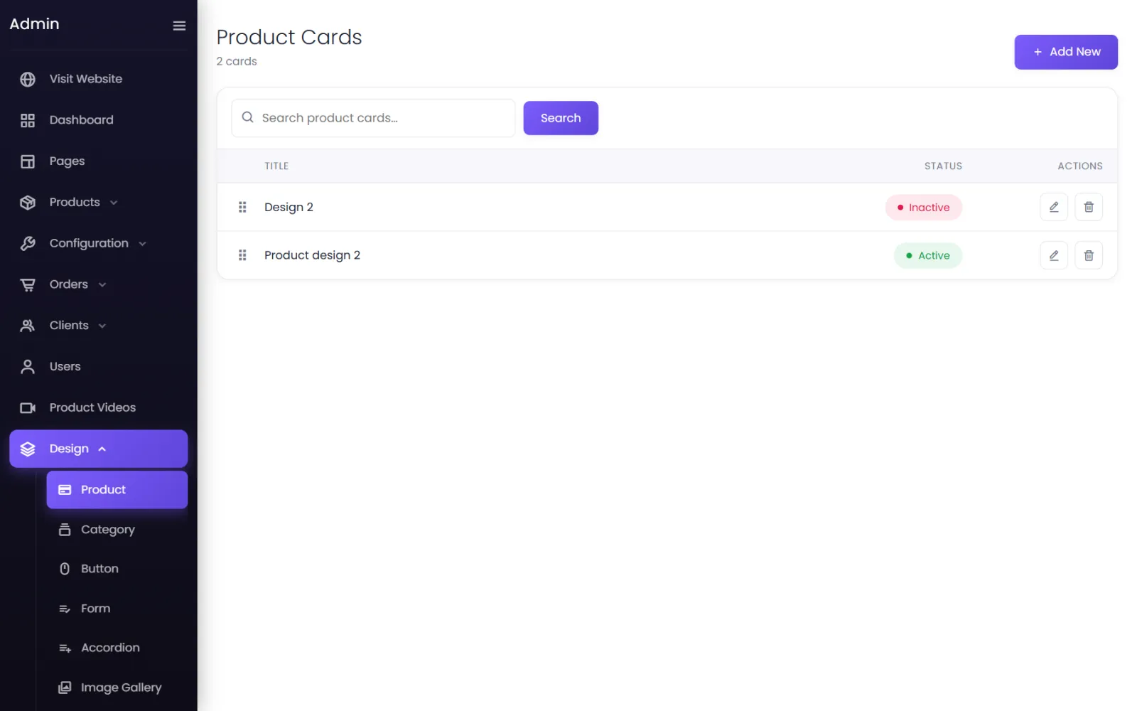
The active design#
You can keep several card designs, but one is active at a time and used everywhere. Set a design's Status to Active to switch to it.
Edit a product card#
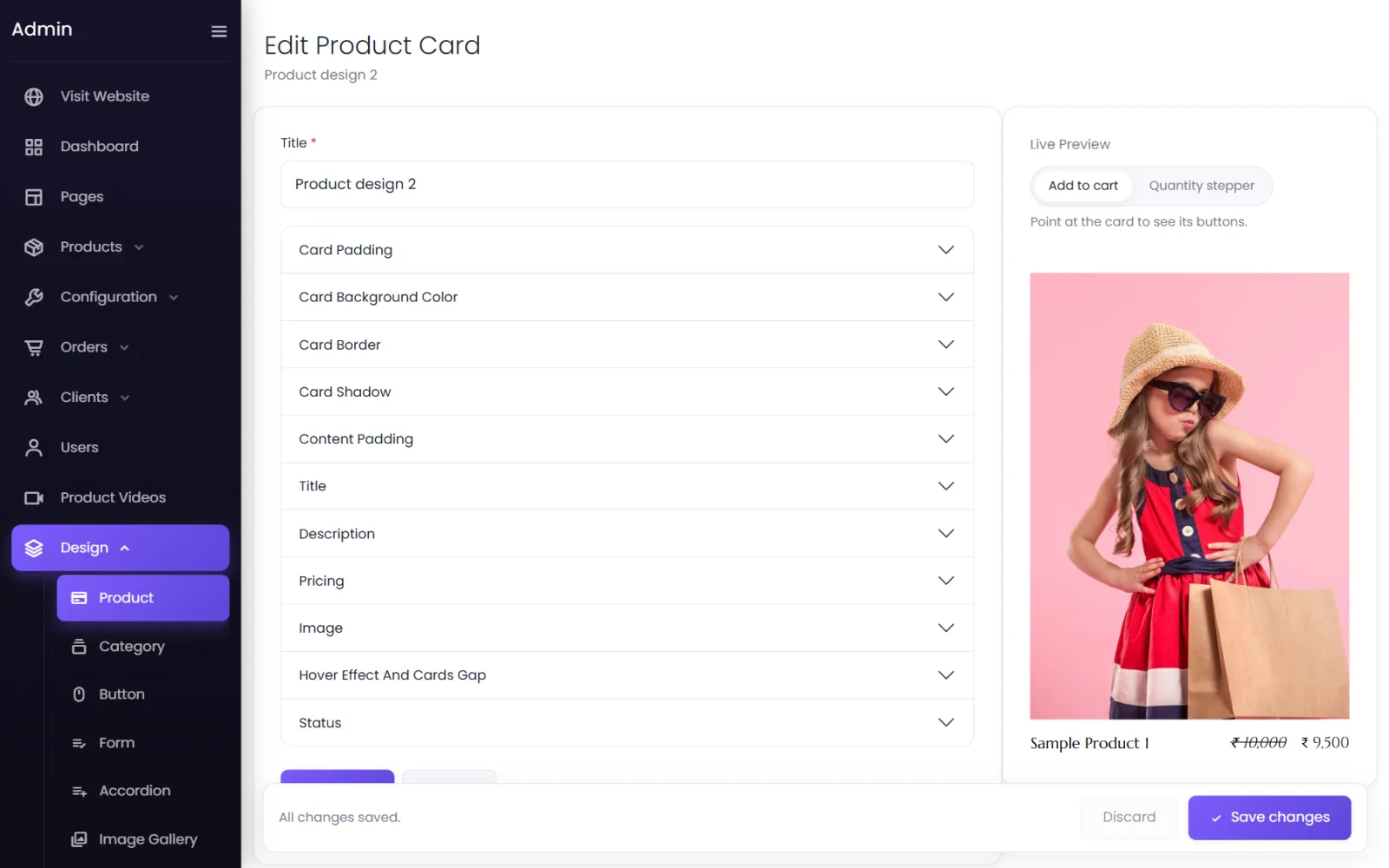
Open a design (or Add New). The settings are grouped, with a Live Preview beside them:
- Card Padding, Card Background Color, Card Border, Card Shadow
- Content Padding
- Title and Description — font, size, colour, lines shown
- Pricing — selling price and struck-through MRP
- Image — shape and fit
- Hover Effect And Cards Gap
- Status
The preview switches between an Add to cart button and a Quantity stepper. Point at the card in the preview to see its buttons and hover effect.
Category and brand cards#
The same idea for category and brand cards: Design → Category and Design → Brand.
Import a ready-made card#
Design → Import Designs lists the card designs included with your plan. Import adds a copy to your store — it does not change the design you are using until you make it active. See Design library.
Was this page helpful?
Something is missing — tell us